Embracing Change: A Fresh Identity for AP+I Design.
AP+I Design is 30 years young this month and we’re celebrating with a new look. More than just a surface makeover, we dug deep to figure out our right next step, one that reflects who we are right now and our unique design point of view.
What went into our brand refresh? Here’s a quick behind-the-scenes look.
Set the intention
The theme of our March company retreat was Amplify. Co-owners and principals Meera and Antonio encouraged us to brainstorm ways we could amplify different aspects of our work: our design, impact, collaboration, capabilities, success and culture.
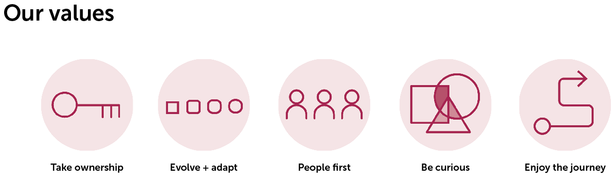
Grounding these efforts were a new vision and mission, rooted in our core values but with an eye on the future.
Our Mission
We believe the best work is done in an environment of trust and respect. We promote a mindset of true partnership within our team and with our clients, empowering all team members to own responsibility for their work and relationships.
Our Vision
Design with Purpose. We believe the future of place-making design is centered on creating human connections. We are a team of designers seeing opportunities to co-create innovative + sustainable solutions tailored to our client’s needs.
The next challenge was to take these statements, these beliefs, and make them tangible. For this, Meera and Antonio turned to Plus, our in-house environmental graphics and brand team.
Chart the course
After working with our marketing team to look at the competitive landscape, the Plus team decided to get back to the heart of our business. Using brand archetypes, each of our colleagues was asked to pick personas that reflected how we saw ourselves and how others saw us. To no one’s surprise, the results perfectly aligned with our previous mission of customer service, responsiveness, and accountability.

At the same time, leadership chose personas that best embody our values and new direction. They confirmed what we kind of already knew: we needed to keep the best parts of our culture (hey, it’s what we’re known for) but give them a boost with renewed focus on thoughtful design and innovation.


Bring it home
Once we settled on a voice and logo, it was time to bring everything together. We wanted to change our headline typeface to be more both approachable and bold, and our secondary typeface to be a pleasure to read. We chose Museo Sans and Freight Sans for their friendly demeanor and the way they played well with each other.
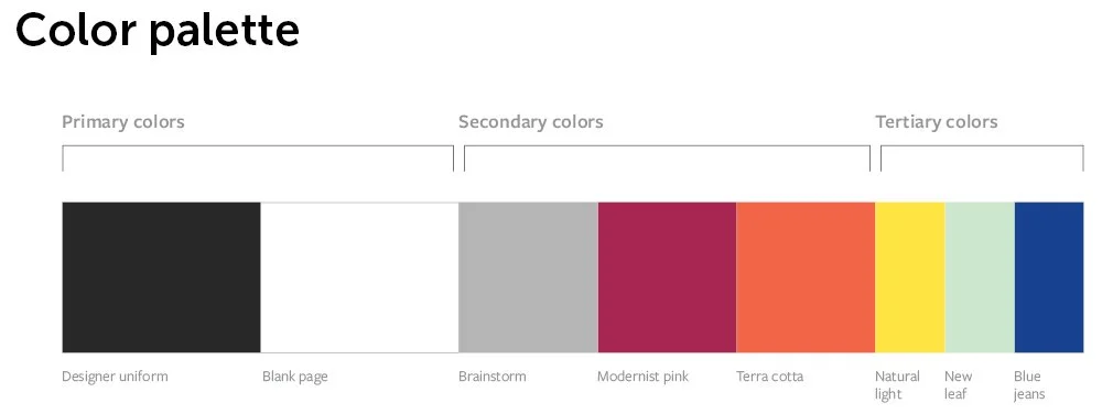
Our logo can certainly stand on its own. But we also wanted to play with color (hey, we’re designers, right?) and these colors are as bright and vibrant as our workplace culture.
We presented the refresh to our colleagues, taking them on the journey from the personas they chose to how those traits made their way into every part of the brand design, because they are a huge part of what inspired us during this entire undertaking.
So, here we are: a new face, but the same warmth and passion for design and our clients, ready for what’s next.